


The EPA's 40-Year-Old Design Manual Is Being Reissued
New audiences can relive Chermayeff and Geismar’s visual standards made for the agency in 1977.
Traditionally, government documents filled with rules for agency aesthetics haven’t been seen as delightful commodities for purchase. Late capitalism is a hell of a thing, though.
The Environmental Protection Agency is currently up for a devastating $2.3 billion in proposed budget cuts by President Trump, straining environmental justice and cleanup efforts and eliminating thousands of jobs. Adding insult to injury, the agency’s new head, Scott Pruitt—a Trump supporter who rejects conventional climate change science—would receive extra security in the same budget to protect himself from activists and his own employees. But while Americans brace themselves for more polluted air, water, and land, they may soon be able to at least relive the EPA’s glory days through a reissued manual of design standards from the late ‘70s.
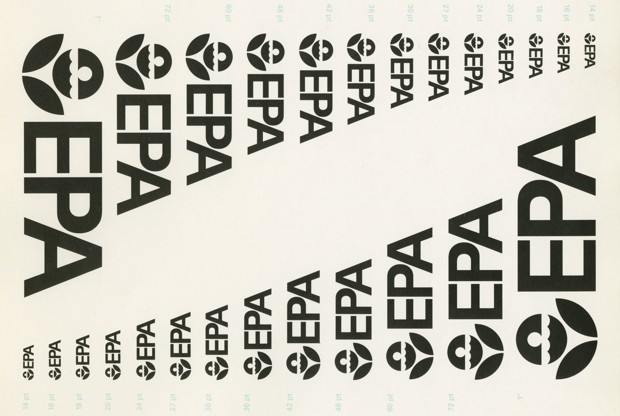
Chermayeff & Geismar’s visual system for the EPA. (Standards Manual, CGH)
The Kickstarter project is—unsurprisingly—being headed by Jesse Reed and Hamish Smyth, who have previously brought the New York City subway and NASA standards manuals back into the world. For this project, they’ve teamed up with the AIGA to reissue the EPA Graphic Standards System as a book. Besides 40-year-old design rules, the book will have new features, including a foreword by Tom Geismar—one of the designers behind the original manual—and 48 pages of photographs from the EPA’s Documerica project.
The original EPA Graphic Standards System was put together in 1977 by the design firm Chermayeff & Geismar (now Chermayeff & Geismar & Haviv). As with so many other government agencies at the time, the project was commissioned by the National Endowment for the Arts’ Federal Graphics Improvement Program, which ran from 1972 to 1981.
(Standards Manual, CGH)
Formed in 1970 under President Nixon, the EPA was tasked with consolidating numerous state offices in the pursuit of creating a cleaner, healthier nation. The agency was losing millions of dollars through design inefficiencies—many of their documents were designed from scratch—and the firm created sophisticated and clear guidelines for them to use instead.
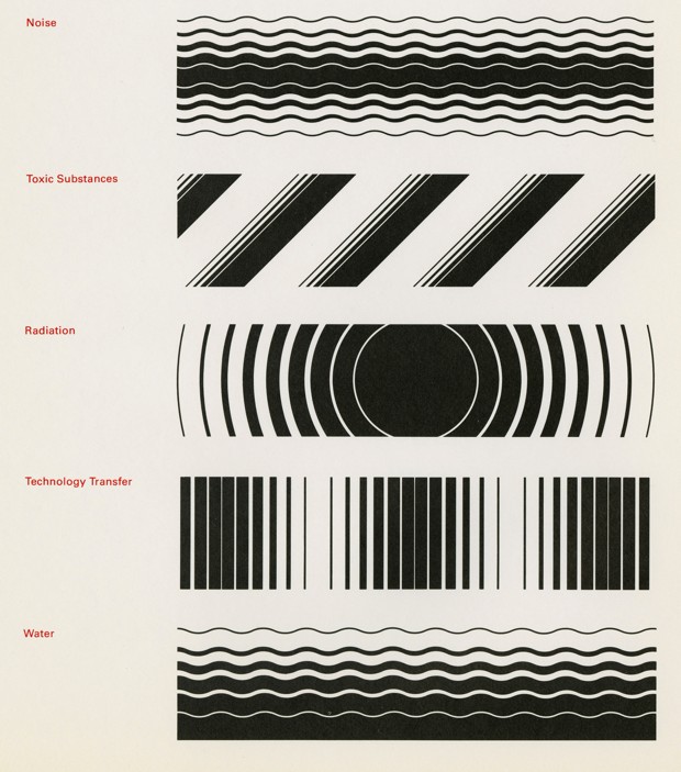
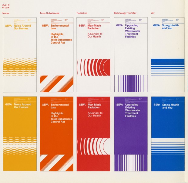
Chermayeff & Geismar, along with designer Steff Geissbuhler—whose personal copy of the original manual was given to the AIGA Design Archives and scanned for the reissue—presented the EPA with a visual system that allowed compelling photography, simple typography, and color to express the young agency’s high-minded values and mission. With a branding system as good as any prestigious corporation at the time (Chermayeff & Geismar also created visual identities for Chase Bank and Mobil Oil), the EPA had a visual identity that lived up to its ideas.
(Standards Manual, CGH)
Today, there’s an appetite among design-minded people for simple relics from what’s often seen as the glory days of modern graphic design. But that appetite isn’t just about aesthetics. It’s no coincidence that some of the most notable standards manual republishing efforts have been devoted to government-run organizations like the EPA, NYCTA, NASA, British Rail, and the Canadian Broadcast Corporation. Behind the intelligence and simplicity of these identities is a meaningful and optimistic public mission. With austerity—and in the case of the EPA, political humiliation—constricting so many of these services today, it’s unlikely the wave of nostalgia will wane any time soon.