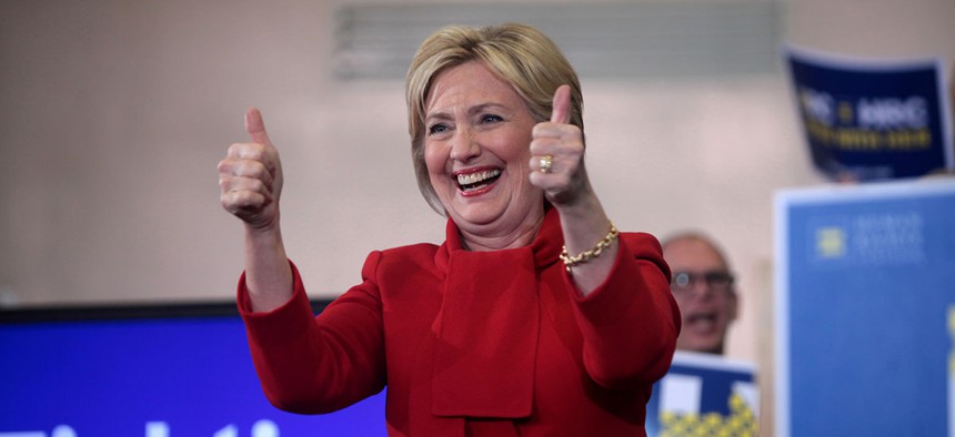
Flickr user Gage Skidmore
Twitter Schools the Clinton Campaign on How Venn Diagrams Work
In hindsight, the graphic was a poor choice for the Democrat.
In hindsight, the Venn diagram was a poor choice.
Hillary Clinton sent out the following tweet Friday, and the internet has been relentlessly mocking her since.
Dear Congress,
— Hillary Clinton (@HillaryClinton) May 20, 2016
Let's get this done.
Thanks,
The vast majority of Americans pic.twitter.com/23ND36tFFm
As FiveThirtyEight’s Ben Casselman noted shortly after:
This isn't remotely how Venn diagrams work. https://t.co/TLFla2wREH
— Ben Casselman (@bencasselman) May 20, 2016
What’s going on here? The Clinton campaign was clearly trying to show mutual ground between Americans and gun owners (their support for universal background checks). But Venn diagrams are supposed to demonstrate common areas of overlap by two separate groups. In this case, gun owners should be part of the Americans circle.
The Washington Post quickly worked up a new data visualization, and it did not involve circles. (While visualizing with circles is possible, reporter Philip Bump said “we didn’t feel like doing advanced math to calculate the size of the curved overlap.”)
We fixed Hillary Clinton's terrible Venn diagram on gun control https://t.co/bySqilp1VO pic.twitter.com/M6656IxTeP
— Chris Cillizza (@TheFix) May 20, 2016
Many others on Twitter, too, decided to use this as a teaching moment for Clinton, demonstrating how Venn diagrams work with Venn diagrams of their own:
@HillaryClinton Here's how venn diagrams work pic.twitter.com/ibtUWbszq1
— James Polk (@james_polk1795) May 20, 2016
.@hillaryclinton pic.twitter.com/daWooyCzOQ
— Michael Deppisch (@deppisch) May 20, 2016
@HillaryClinton pic.twitter.com/e1MWUxOQwW
— Travis (@travislylesnews) May 20, 2016
@senatorshoshana @HillaryClinton pic.twitter.com/SmgmExXLMW
— Luke Thompson (@ltthompso) May 20, 2016
(Top image via Flickr user Gage Skidmore)


