The Society for Experiential Graphic Design


The Federal Highway Administration's Sudden U-Turn on Highway Fonts
Clearview is out, Highway Gothic is (back) in. Critics want to know why.
In a notice posted in the Federal Register on Monday, the U.S. Federal Highway Administration announced a small change that has huge implications for the nation. The agency terminated an order it had issued back in 2004 approving the use of a new font in highway signs. Now those signs are going to change. Again.
By ending its “Interim Approval for Use of Clearview Font for Positive Contrast Legends on Guide Signs,” the FHWA reversed its position on Clearview, a font developed to improve highway-sign legibility on the roads. In 2004, the agency embraced Clearview, based on studies that appeared to demonstrate its superiority, especially in nighttime driving tests.
Just 12 years later, the FHWA is changing course: Highway Gothic is the only font for U.S. highways going forward.
The announcement took Donald Meeker by complete surprise. Meeker is one of the designers responsible for the Clearview font (along with James Montalbano). His firm, Meeker and Associates, which specializes in environmental graphic design, tested Clearview with the Pennsylvania Transportation Institute at Penn State University over the course of the 1990s.
“It’s unfortunate. It’s a shock. This is a big deal,” Meeker says.
A New Font for Older Drivers
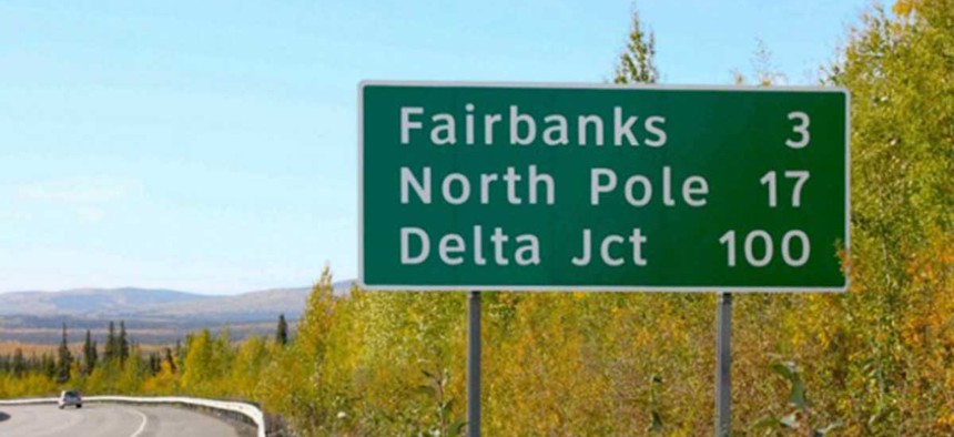
Clearview was made to improve upon its predecessor, a 1940s font called Highway Gothic, at a time when an aging Baby Boomer generation meant lots of older drivers on the road. Certain letters appeared to pose visibility problems, especially those with tight interstices (or internal spacing)—namely lowercase e, a, and s. At night, any of these reflective letters might appear to be a lowercase o in the glare of headlights.
By opening up these letterforms, and mixing lowercase and uppercase styles, Clearview aimed to improve how these reflective highway signs read.
“Helen Keller can tell you from the grave that Clearview looks better,” Meeker says.
At the time, the FHWA agreed. In its 2004 approval memo, the agency noted that Clearview boosted highway-sign legibility for drivers traveling at 45 miles per hour by 80 feet of reading distance—or 1.2 seconds of bonus reading time. Another broad study, performed by the Texas Transportation Institute at Texas A&M University, backed up the results of the Penn State study. Meeker and his colleagues outlined their findings in the Transportation Research Record.
“What all of the research has shown is that there is a lot about users’ reactions to different types of fonts on wayfinding (and regulatory and warning) signs that we still don’t understand,” says Martin Pietrucha, one of the researchers at the Pennsylvania Transportation Institute who worked on the testing and development of Clearview. “Shutting down any future work in this area sets in stone the idea that any improvement in this area is not possible, or that seeking improvements in this area is not worth the effort. I respectfully disagree.”
From the start, Clearview was greeted as a civic, social, and design success. Around 30 states have adopted the font, making it arguably the dominant design paradigm on U.S. roads. Print magazine called it one of the 10 typefaces of the decade in 2010. The Clearview typeface family was the first digital font ever acquired by the Cooper-Hewitt, Smithsonian Design Museum. People behind the font spoke about it with swagger.
An About-(Type)face
Was everyone wrong? The FHWA explains its about-face on Clearview by pointing to further research after 2004. The boost in legibility, for example, could be attributed to simply replacing older signs with newer signs.
“After more than a decade of analysis, we learned—among other things—that Clearview actually compromises the legibility of signs in negative-contrast color orientations, such as those with black letters on white or yellow backgrounds like Speed Limit and Warning signs,” says Doug Hecox, a FHWA spokesperson, in an email.
In fact, the FHWA stopped granting approval to use Clearview at least two years ago. In an April 2014 letter denying a request from transportation officials in Grays Harbor County, Washington, to begin using Clearview, the director for the FHWA Office of Transportation Operations, Mark Kehrli, listed other reasons for rejecting Clearview.
“The narrower series of the alternative alphabets were not developed for and are not recommended for or conducive to conventional roadway signing, particularly Street Name signs,” Kehlri wrote. “Based on these and other reasons, we expect to rescind the Interim Approval in the near future.”
This window into the approvals process reveals another problem that may have doomed Clearview: The font was never a mandate, only an alternative. As a result, some places have inconsistent usage; local jurisdictions may be using the font in states that are not. Font forum posters report seeing Clearview in Orange County, while California (which received permission to pursue Clearview) still abides by Highway Gothic.
Local and state governments that have taken up Clearview don’t have to remove signs that feature this font. But as these signs are eventually replaced, the new ones that take their place will be throwback Highway Gothic signs.
Cost May Be a Factor
Officials in Canada and Indonesia have promoted Clearview as a standard.Transport, which was designed for U.K. roads by Jock Kinneir and Margaret Calvert, is the most famous example of a systemic transportation font standard. Clearview evolved as an outside recommendation, a best-practices approach from the private sphere, not as a regulatory shift. In the U.S., Meeker says, institutional interest in better standardization is tepid.
“Traffic design is the greatest public manifestation of government on any given day,” Meeker says, “and yet it’s the most dreadful, tired, unresearched, undesigned part of the public interface with government.”
The FHWA has not yet provided any research on Clearview that disproves the early claims about the font’s benefits. But there is at least one factor that clearly distinguishes it from Highway Gothic: cost. Jurisdictions that adopt Clearview must purchase a standard license for type, a one-time charge of between $175 (for one font) and $795 (for the full 13-font typeface family) and up, depending on the number of workstations. (Meeker and Associates disclaimed exclusive rights to the “Clearview” copyright.)
The alternative is a design that hasn’t changed substantially since the 1960s.
“This is a burr in somebody’s saddle,” says Meeker, who adds that he’s preparing a rebuttal to the news. “They don’t understand design.”