


Ditch the Memo for a Dashboard: How to Show Your Program's Progress
Tell your story with infographics that link metrics and chief indicators.
In today’s environment of diminishing resources and high expectations for performance, it is increasingly important for federal managers to be able to demonstrate the success of their programs to important decision-makers. There are a few ways to demonstrate your program’s success:
- You could write a report or memo that will get lost in the shuffle of other similar-looking memos and reports
- You could develop a PowerPoint presentation with text heavy bullet points and hope for the opportunity to brief it to someone of importance
- Or, you could focus more on telling a compelling story
But how do you tell a compelling story without straying into the far-too-familiar territory of copious amounts of paper? Consider a visual representation of your success in the form of a dashboard, a series of graphics that show progress toward individual milestones and the connections and linkages between metrics.
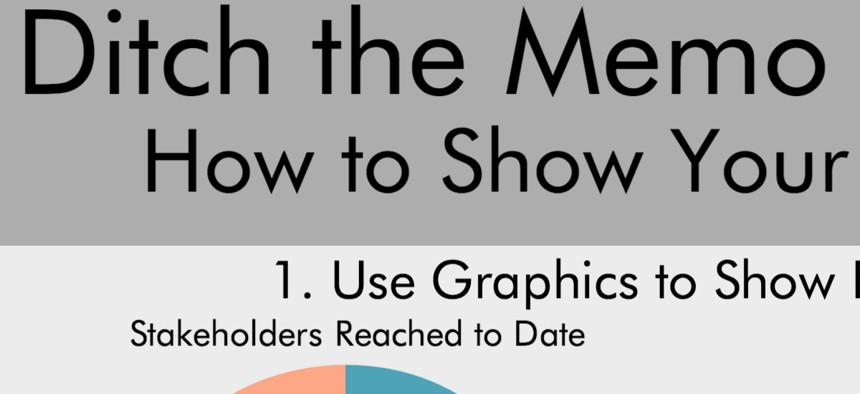
If your program is built around quantifiable metrics or milestones (if it isn’t, it should be!), these metrics may lend themselves to building charts or line graphs to show progress. You could even consider more complex graphics showing more than two data points and how they relate to each other to really show the value of your program.
Showing connections and linkages between metrics, instead of describing them individually, is an important part of telling the story. For instance, in your dashboard you can show the connection between outreach materials developed, and the number of stakeholders reached easier and in a more interesting manner than you can in a memo or report. You could also show the connection between financial spending and program milestones. Visually portraying the number of stakeholders reached in relation to the amount of money spent on outreach can better show your “bang for your buck” and can demonstrate your ability to do great work with the resources you’ve been given. After all, one of the chief indicators of your program’s priorities is where you and your stakeholders are spending their money.
Not only can you use a graphic or dashboard to tell a story about your program’s successes, but you can also use it to more easily detail a process, cycle or timeline. We’ve all seen PowerPoint presentations with arrows and blocks of text that all start to look the same over time. While you can certainly create a project timeline in Excel or PowerPoint, using an infographic can make the agenda more engaging for your employees, or your boss. You can even make a mundane meeting invite or agenda more compelling by giving it a new shape in an infographic. In this way, you can capture the attention of meeting attendees before they even step in the room.
If your organization requires that you stick to the traditional memo route, that’s OK–you can still create some great graphics to accompany the memo. In this case, the memo can serve to fill in the blanks and provide additional analysis to accompany your graphics.
Check out some examples of how you can show your program’s progress here. What creative methods do you use to show your program’s progress?
