chungking/Shutterstock.com


This Map Wants to Change How You Think About Your Commute
With the help of 4.2 trillion points of data.
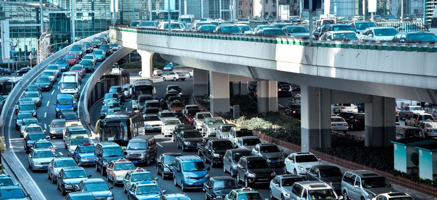
Every year, the Texas A&M Transportation Institute releases an oft-cited (and oft-critiqued ) Urban Mobility Report that measures congestion on American roads, famously ranking the metros with the most heinous traffic . The report homes in on a central cost of mobility: the price we pay to sit in gridlock.
It does not, however, look much at the value we get for paying that cost: access to wherever we're trying to go.
"When we think about this as economists, we know that every trip that is made is worth it – the value outweighs the cost of taking it – or it wouldn't have happened," says Andrew Owen, the director of the recently created Accessibility Observatory at the University of Minnesota. "It's a little bit disingenuous to use metrics that only talk about the cost of travel."
Consider a metric – or a map – that captures value instead. Not: How long will it take me to reach my office? But: How many jobs can I reach in half an hour? How many grocery stores are accessible by car within five minutes? Which neighborhoods in town enable the greatest accessibility, by public transit, to really good restaurants?
"We’re interested in looking at how well transportation systems connect people to the things they want to reach," Owen says, "not just how well they let people move around in space."
What would that look like? For starters, this map of the Minneapolis/St. Paul region, created by the Accessibility Observatory:


( Image via chungking / Shutterstock.com )