Enigma.io


Infographic: Visualizing the Shutdown's Real-Time Impact on Federal Employees
A striking real-time data visualization of the shutdown's scope.

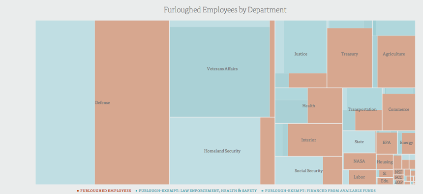
It’s hard to really process the effect of the government shutdown. Rattling off that 97 percent of NASA is furloughed, that national parks are closed and that sad kids in bear costumes can’t go to the zoo doesn’t really capture the impact of what we’re currently witnessing happen to the public sector. With something this broad, complex and, frankly, bleak, a picture is more helpful. This picture.
Dan Delany at Enigma.io took it upon himself to compile all the lapse planning data submitted to OMB into one spreadsheet and process it into a striking interactive showing the real time cost of the shutdown ($1.8 billion in unpaid salaries and rising), the number of employees furloughed and the percentage breakdown of furloughs by department.
It’s well worth a look: Government Shutdown 2013 Visualized
[h/t Gizmodo]