


A Brief History of the US Government’s Awful Graphic Design
For as much as feds use PowerPoint, we're pretty bad at it.
The revelation that major US technology companies are participating in a National Security Administration surveillance program was shocking enough. And that was before we saw the top-secret slides used by the government to describe the spying operation. They are, to put it mildly, heinously ugly…
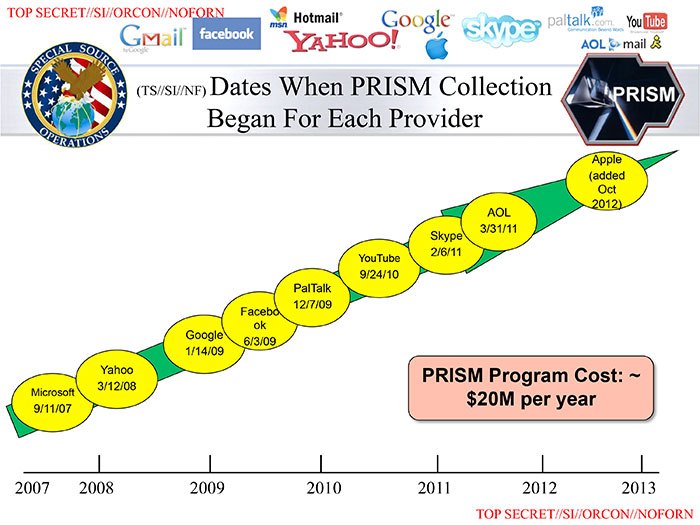
The slides immediately attracted scorn on Twitter, even inspiring graphics luminary Edward Tufte to weigh in:
List of spy-PRISM collected information includes nearly everything, except PPT decks. No useful information at all? twitter.com/EdwardTufte/st…
— Edward Tufte (@EdwardTufte) June 7, 2013
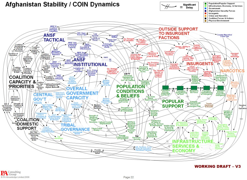
The US government, though, is no stranger to bad graphic design. The Department of Defense is a particularly egregious offender, with its hopelessly complex network diagrams…