


When disaster strikes, leaders rely on data to make informed and strategic decisions. In the case of a tornado or hurricane, for instance, the data tells a story — where the disaster hit and who was impacted. Leaders can then use this insight to provide aid and relief to the communities affected.
So, when the novel coronavirus hit communities across the U.S. earlier this year, government leaders knew they had to arm themselves with accurate and relevant data to make informed decisions. Today, as COVID-19 continues to spread in communities across the country — some affected more than others — federal leaders are looking to data visualization and analysis to map the spread of the virus and allocate resources to the communities most vulnerable.


Realizing the Power of Public Data
In stopping the spread of COVID-19, many citizens struggle to get the information they need. That’s because there are a number of different data narratives floating around about the spread of the virus. To combat this misinformation, communicating accurate data to the public is more important than ever before.
“During this time, state, local and federal agencies have all realized that data has great power,” said Srinivas Kosaraju, senior director of public sector solution engineers at Tableau. “Not only can it help you to direct the resources you have and impact your response, but it also helps you to inform the public.”
Kosaraju would know: Since before COVID-19, he and his team at Tableau have been partnering with federal leaders to create and deliver public-facing dashboards.
For example, the U.S. Agency for International Development used Tableau to build the Global Health Data Analytics Hub, a dashboard that aggregates data to help inform agency decisions about resource allocation around the world. USAID also created an enterprisewide Data Fellowship program, which uses data from these dashboards to illustrate shared global health initiatives. Today, USAID is more empowered than ever to make decisions based on data that is accurate and accessible.
This type of open data also helps government leaders communicate across levels of government. The Federal Emergency Management Agency data visualization website for example, provides interactive maps and visualization tools about pertinent disaster information. State and local leaders rely on these visualizations to make informed decisions for their constituents, Kosaraju said.
“One of the great things about public data visualizations is it can allow customers to get inspired about how they can use data. It really gets ideas flowing in terms of the art of the possible.”
ROB BOHN, REGIONAL VICE PRESIDENT OF PUBLIC SECTOR, TABLEAU

Using Data to Help Solve a Crisis
Now, with a global pandemic on their hands, agencies rely on those same tools to analyze important health data and communicate with the public about the virus.
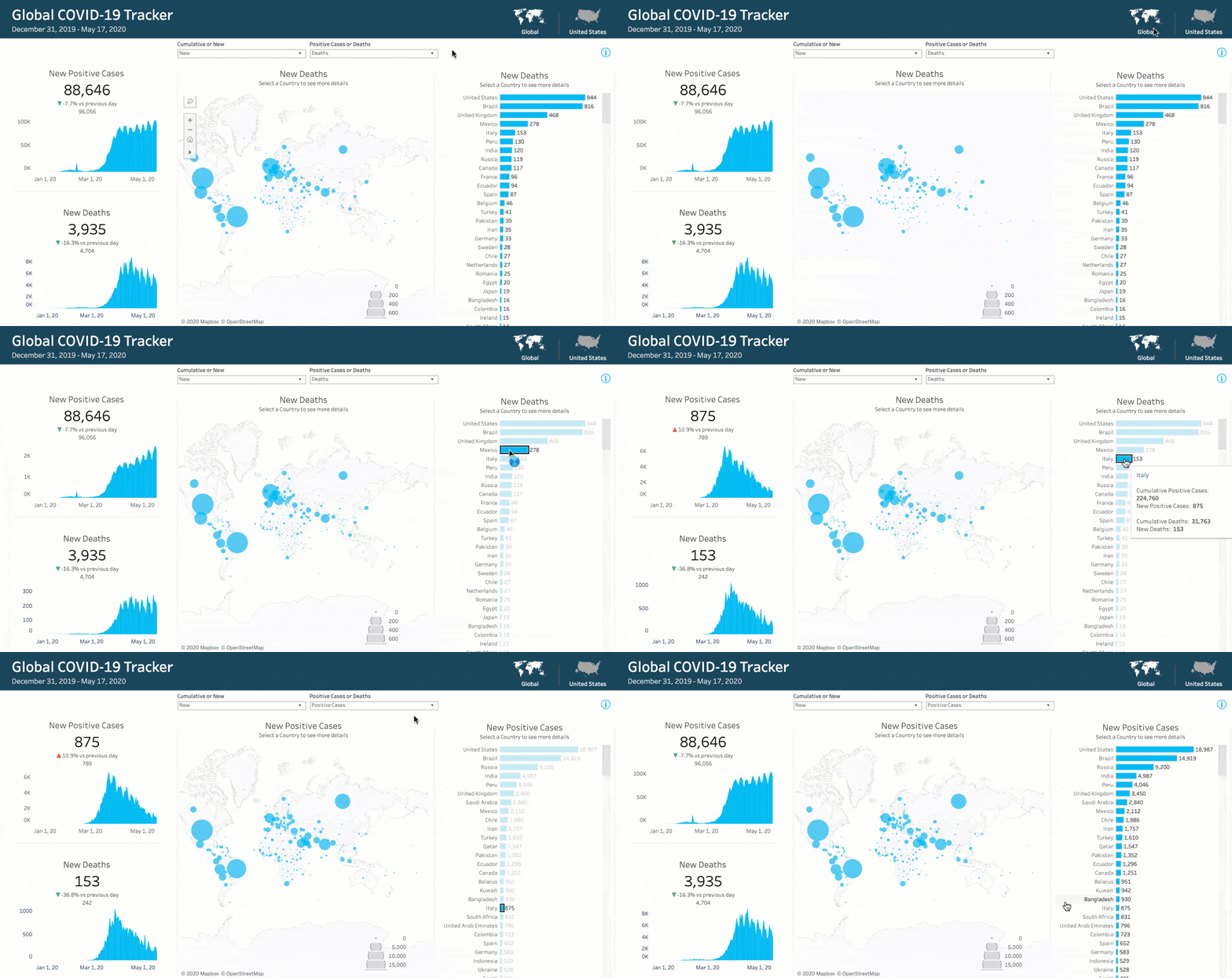
To meet this urgent need, Tableau has designed a COVID-19 Cases Starter Workbook, a downloadable asset linked to accurate and reliable data sources about COVID-19 cases and allows agencies to incorporate their own data into these visualizations. This resource is part of Tableau’s larger COVID-19 Data Hub initiative, a one-stop shop for organizations looking for resources to help them contextualize the pandemic using trusted sources from around the world. Agency leaders can also interact with Tableau’s public government data trackers, which help public sector leaders understand how they can communicate this information to constituents.
“One of the great things about public data visualizations is it can allow customers to get inspired about how they can use data,” said Rob Bohn, regional vice president of public sector at Tableau. “It really gets ideas flowing in terms of the art of the possible.”


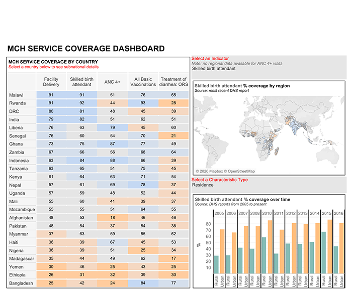
MCH Coverage Dashboard
LEARN MORE >>
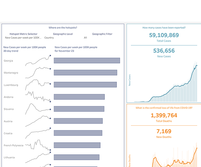
Stay Informed with Daily Updates
LEARN MORE >>
Accelerating Digital Transformation in Federal Government
While COVID-19 has posed several challenges and hardships for government agencies, perhaps one positive outcome — at least as far as data and IT professionals are concerned — is its acceleration of digital transformation initiatives across the public sector.
“Government is taking advantage of the crisis and turning that into data transformation and a digital transformation,” Kosaraju said. “Most of the agencies that we've been working with have identified a 2-year or 3- or 4-year roadmap toward data transformation. Now, with COVID, we’re seeing those timelines rapidly accelerate. Agencies all of a sudden are thinking about their data strategy in a way that they never have.”
But to keep this momentum going, agencies must begin to understand the power of data visualization in decision-making. “Adopting a data visualization strategy from the very beginning will lead to better customer experience, better user experience and better engagement of government employees,” Bohn said.

Learn more to find out how Tableau can help your organization leverage data visualization to communicate with constituents about COVID-19.